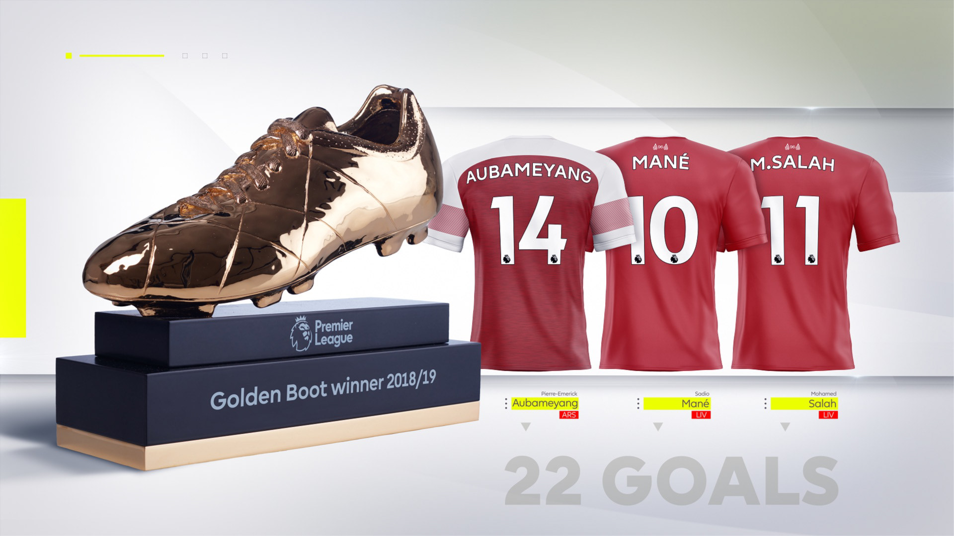
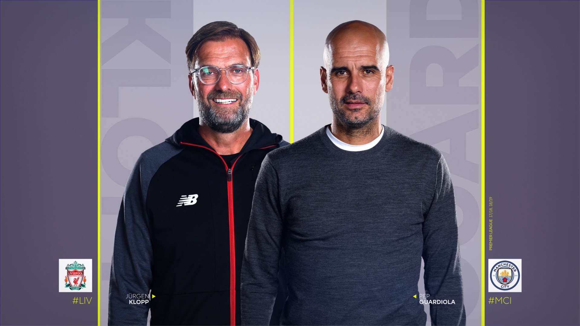
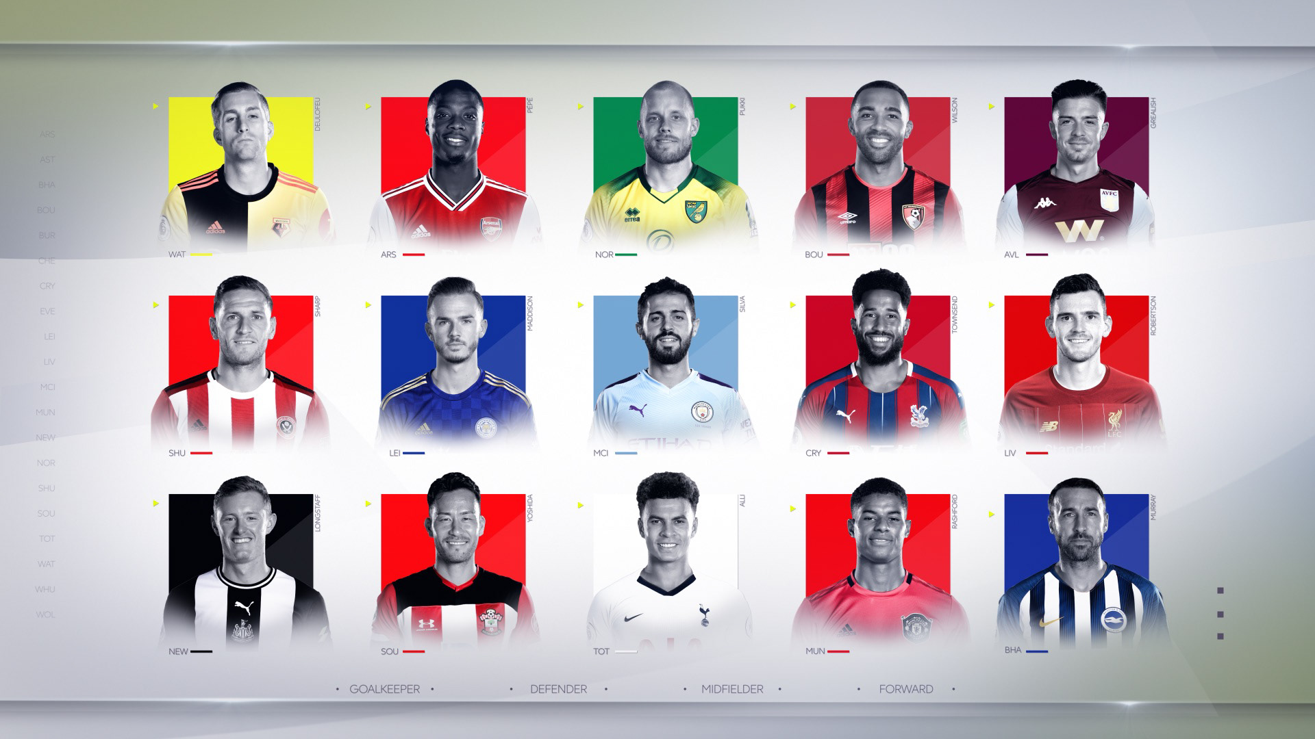
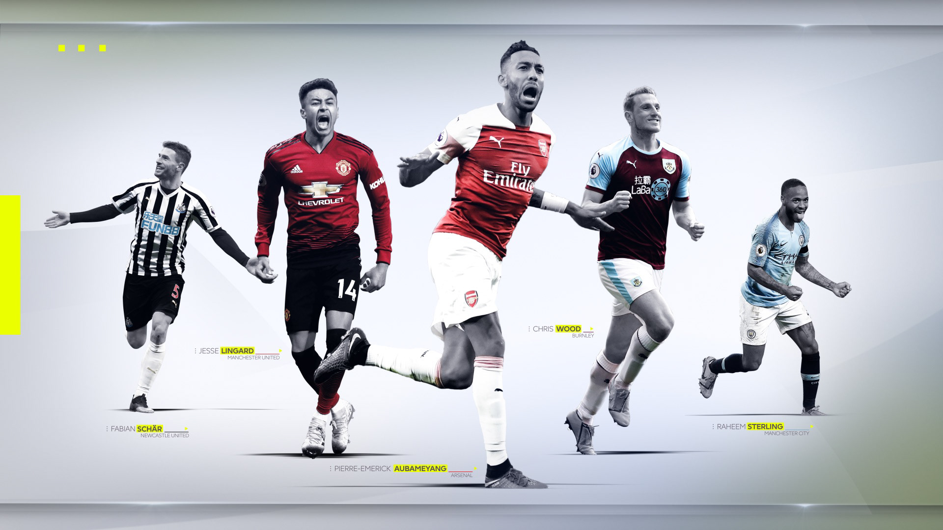
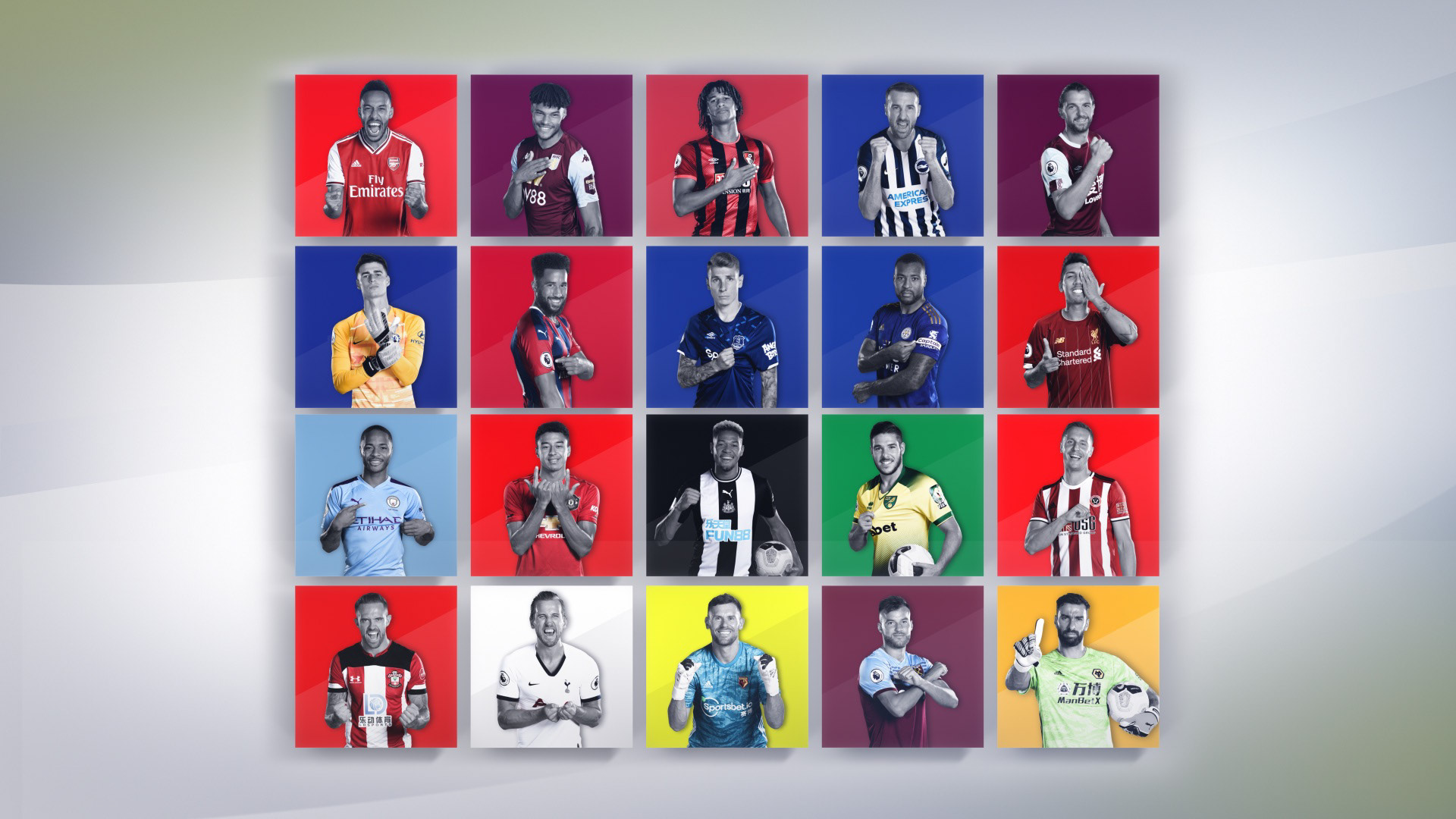
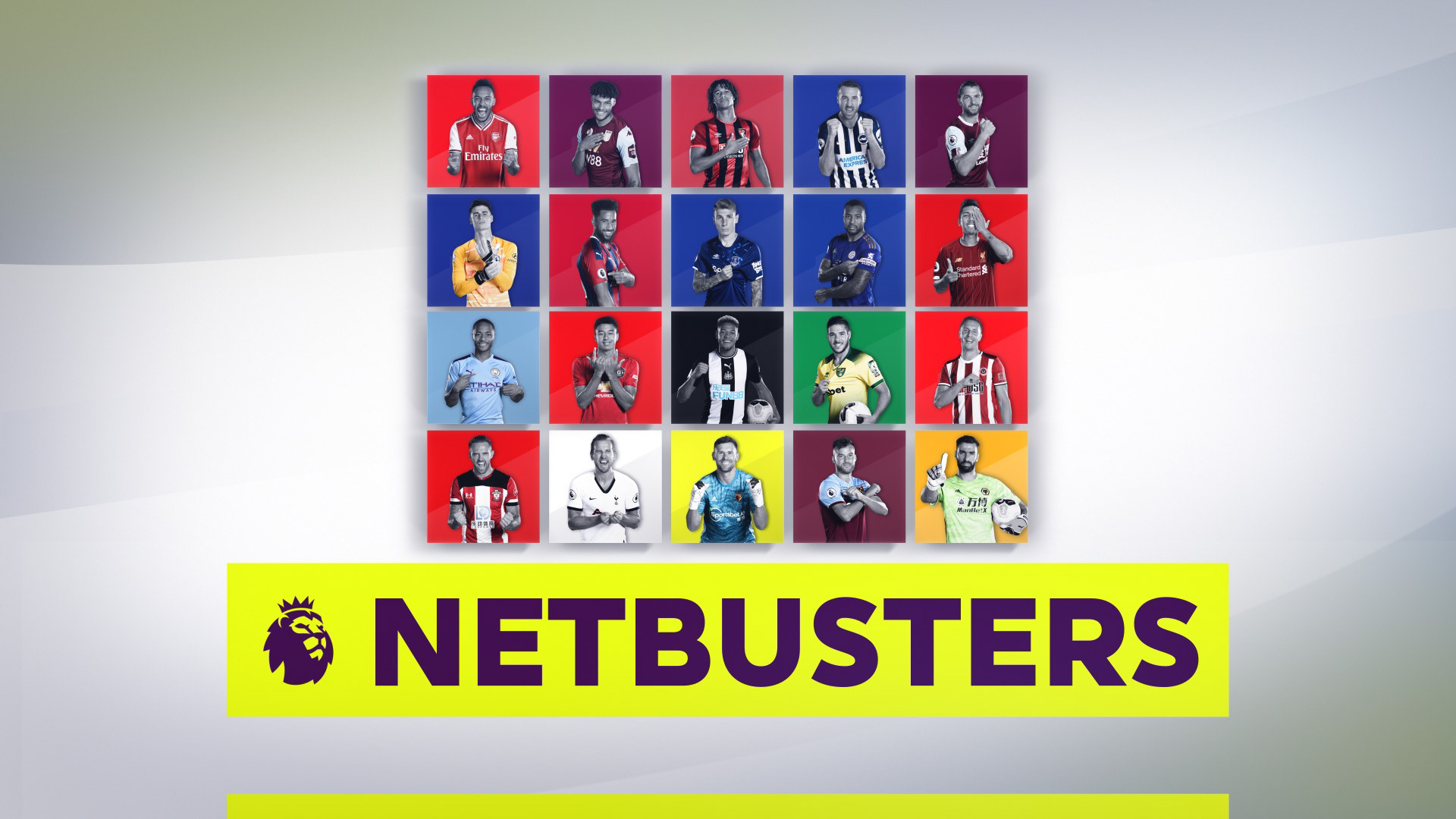
A modern and graphical title sequence was required for the title sequence for Netbusters.
A show that reflects the previous weekends action and the title sequence we created would have to be updated each year and last for three seasons.
Lots of style frames were created and developed turning into the titles which introduce the programme and can be seen on channels all over the World.
Trying to find the right balance in a 20 second title sequence once the intro and end lock up are accounted for was quite a challenge. Also striking the correct amount of clean design yet keeping things moving was a task I believe we met.
